The Poster design was one of the earliest forms of advertisement and began to develop as a medium for visual communication in the early 19th century. They influenced the development of typography because they were meant to be read from a distance and required larger type to be produced, usually from wood rather than metal. The poster quickly spread around the world and became a staple of the graphic design trade. Many artists as well, such as Henry Toulouse-Latrec and Henry van de Velde, created posters.
They were used to promote various political parties, recruit soldiers, advertise products and spread ideas to the general public. The artists of the international typographic style of design believed that it was the most effective tool for communication and their contributions to the field of design arose from the effort to perfect the poster. Even with the popularity of the internet posters are still being created every single day for all sorts of reasons.
The Birth of the Lithographic Poster design (1880 – 1895)
The process of lithography print was invented in the year of 1798, however for decades it was a sluggish and expensive for any sort of poster production. During these period posters used to be of simple wood or metal engravings with little color or design. This changed around in the year of 1880 with Cheret’s stone lithographic process. This was a breakthrough which allowed artists to achieve every color in the rainbow with as little as three stones – usually red, yellow and blue – printed in careful registration.
Cheret’s process nevertheless still demanded superb artistry and remarkable craftsmanship. The result was worthwhile – a remarkable intensity of color and texture, with sublime transparencies and nuances impossible in other media (even to this day). The ability to combine word and image in such an attractive and economical format finally allowed the lithographic poster to usher in the modern age of advertising. An extremely gifted artist as well, Cheret ushered in that age by creating more than 1000 posters over a 30 year career.

Jules Cheret, Eldorado (Courrier Francais edition), 1894
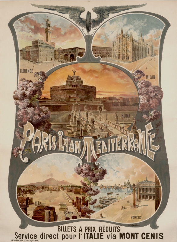
Cussetti, Paris Lyon Mediterranee – Italie, 1895

Jules Cheret, Musee Grevin (before letters), 1900
1890 – 1900: The Belle Epoque & Art Nouveau
In 1891, Toulouse-Lautrec’s extraordinary first poster, Moulin Rouge, elevated the status of the poster to fine art and touched off a poster craze. During the 1890s, referred to as the Belle Epoque in France, poster exhibitions, magazines and dealers proliferated; the pioneering Parisian dealer Sagot listed 2200 different posters in his catalog!
Just three years later, Alphonse Mucha, a Czech working in Paris, created the first masterpiece of Art Nouveau poster design. Bearing multiple influences including the Pre-Raphaelites, the Arts and Crafts Movement, and Byzantine art – this flowering, ornate style became the major international decorative art movement up until World War I.
Despite cross-pollination, distinctive national styles also became apparent – Dutch posters were marked by restraint and orderliness; Italian posters by their drama and grand scale; German posters for their directness and medieval influence.

Henri de Toulouse-Lautrec, Moulin Rouge, 1891

Henri de Toulouse-Lautrec, Catalogue d’Affiches Artistiques / A. Arnould (Debauche), 1896

Louis Rhead, The Sun, 1894

Adolfo Hohenstein, Fiammiferi Senza Fosforo (small), 1895 ca.

Alfred Mohrbutter, Kunst Austellung – Crefeld, 1897
1900 – 1914: The New Century & Early Modernism
By 1900, Art Nouveau had lost much of its dynamism through sheer imitation and repetition. The death of Toulouse-Lautrec in 1901 and the abandonment of poster art by Mucha and Cheret (who both turned to painting) left a void that was filled by a young Italian caricaturist named Leonetto Cappiello, who arrived in Paris in 1898.
Strongly influenced by Cheret and Toulouse-Lautrec, Cappiello rejected the fussy detail of Art Nouveau. Instead he focused on creating one simple image, often humorous or bizarre, which would immediately capture the viewer’s attention and imagination on a busy boulevard. This ability to create a brand identity established Cappiello as the father of modern advertising. His style would dominate Parisian poster art until Cassandre’s first Art Deco poster in 1923.
A key outgrowth of these modernist efforts was the German Plakatstil, or Poster Style, which was begun in 1905 by Lucian Bernhard in Berlin and in Munich by Ludwig Hohlwein. Minimalized naturalism and emphasis on flat colors and shapes made their work the next step towards creating an abstract, more modern visual language.


Leonetto Cappiello, Mele: Novita Per Signora (Green), 1903

1914 – 1919: World War I & the Bolshevik Revolution
The lessons of brilliant American advertising in WWI posters were not lost on the Bolsheviks, who turned to poster art to help win their civil war against the Whites. Lenin and his followers proved to be the pioneering masters of modern propaganda, and the poster became a weapon of choice throughout the century in both hot and cold wars everywhere.

Stoner, Official United States War Films (Infantrymen), 1917


1919 – 1938: Between the World Wars: Modernism & Art Deco
The term Art Deco is derived from the “Decorative Arts” Exposition of 1925 in Paris, which proved to be a spectacular showcase for the style. In Paris, the caricature style of Cappiello gave way to the geometric, intellectual images of A.M. Cassandre, who popularized air brush techniques that lent a machine-like surface to his images. His towering posters of the Normandie, Statendam and Atlantique ocean liners became icons of the Industrial Age. Art Deco, like Art Nouveau before it, spread quickly throughout Europe and to the U.S.


A.M. Cassandre, Nord Express, 1927


1938 – 1950: World War II & the End of Stone Lithography
The last gasp of the lithographic poster occurred in Switzerland, where the government heavily promoted the printing industry and poster excellence. Appealing to the Swiss sense of precision, the Sachplakat, or Object Poster Style, developed in the Twenties but blossomed during WWII and the early Fifties in the Basel area. Its artists delighted in making everyday objects into giant icons, utilizing spectacular Swiss printing to create wonderful trompe l’oeil effects. With roots going back to the Plakatstil of Lucian Bernhard and the Surrealist movement, visual elegance was often matched by gentle humor.

Herbert Leupin, Trink Lieber Eptinger! (Drink more Eptinger water!), 1947


1945 – 1965: Post-World War II & Mid-Century Modernism
Despite the looming tensions of the Cold War, the end of World War II ushered in a baby boom and a new consumer society with the arrival of television, jet travel and global brands fueling the way.
Advertising methods shifted to adapt to the times. A veritable “poster boom” occurred in the early 1950s, driving forward two distinct styles, one consumer and one corporate. The first, which we have labeled the ’50s Style, was brightly colored and whimsical, while the second, called the International Typographic Style, was more rational and orderly.
Posters designed in the ’50s Style used vivid colors and playful motifs to appeal to a broad audience. Artists like Herbert Leupin and Donald Brun in Switzerland, Paul Rand in the US, and Raymond Savignac in France exemplify the style’s lighthearted qualities. The ’50s Style was applied to consumer services as well as products. Ever present were marvelous airline campaigns by David Klein, Stan Galli and others which sought to attract travelers to destinations like Disneyland, New York, Las Vegas, and Paris.
The International Typographic Style, or Swiss Style, was also perfectly suited to the increasingly globally connected world. Highly structured, systematic designs granted order and clarity to everything from highways and airports to product instruction manuals.
Influenced by the Bauhaus and Tshichhold’s New Typography, this style developed in Switzerland in the late ’50s and ’60s. It employed basic typographic elements with strict graphic rules and often replaced illustration with stark, “modern” photography. The concert posters of Josef Muller-Brockmann represent the classical apotheosis of this style – cool, elegant and systematically abstract. On the same level was Erik Nitsche’s “Atoms for Peace” series of spectacular posters for the first International Conference on the Peaceful Uses of Atomic Energy.

David Klein, Las Vegas – Fly TWA (Constellation), circa 1955


1965 – 1972: The Sixties & the Art of Rebellion
The orderliness of the Fifties would yield to a more chaotic and revolutionary tenor by the mid-Sixties. A new illustration style, one which borrowed freely from Surrealism, Pop Art and Expressionism, was more relaxed and intuitive and the first wave of a Post-Modernist sensibility. A famous example was Milton Glaser’s 1967 Bob Dylan record album insert. Glaser crystallized the musician’s counter-cultural message by portraying his long hair as a rainbow of richly flowing waves. Glaser’s Push Pin Studio was matched in creativity by a dynamic school of poster art in Poland from the ’50s through the ’80s. The Polish School became known for a sardonic and gut wrenching variety of Surrealism in promoting the State-controlled theatre and cultural organizations.
The excesses of the drug culture and political alienation led to a brief but spectacular Psychedelic Poster craze in the U.S., which recalled the floral excesses of Art Nouveau, the pulsating afterimages of Op-Art, and the bizarre juxtapositions of Surrealism. And the French May Day protests generated a school of propaganda poster design that harked back to the Soviet poster and cartoon art.


Milton Glaser, Dylan, 1966
1970 – 1989: The Seventies & Eighties – Post Modernism
The International Style spread beyond Switzerland rapidly and became the leading graphic design style worldwide in the Seventies. By the early Eighties, the style began to give way to the Post Modernists, who sought to break the formal and dogmatic rules of the Swiss Style.
A young teacher in Basel named Wolfgang Weingart led the palace revolt which ushered in today’s predominant graphic style loosely known as Post Modern design. Weingart experimented with the offset printing process to produce posters that appeared complex and chaotic, playful and spontaneous – all in stark contrast to his elders’ teachings. Weingart’s liberation of typography was an important foundation for several new styles, from Memphis and Retro, to the advances now being made in computer graphics.

Paul Rand, IBM (Rebus – 1st Printing), 1981


1990 on: The Poster Design Today
The role and appearance of the poster design has changed continuously over the past century to meet the changing needs of society. Although its role is less central than it was 100 years ago, the poster will evolve further as the computer and the worldwide web revolutionize the way we communicate in the 21st century.


Ralph Schraivogel, Newman – Filmpodium, 2001
Article credit: A BRIEF HISTORY OF THE POSTER
Pretty! This was an incredibly wonderful post. Thank you for providing this information. Kassie Raimondo Annadiana